Visualized Financial Statement Analysis
The use of Excel and graphics, commonly referred to as data visualization, can provide a fuller or more holistic view of changes in an entity. Does the traditional audit or report that is devoid of data visualization serve the client? In this article, the author “propos[es] not a replacement for ratios…but rather that financial statement analysis should return to a more holistic analysis of a set of financial statements.” The author showcases how Excel can be used to present a more holistic picture.
 On my first engagement at one of the big accounting firms, my supervisor asked me to do comparative revenue analytics by each month of operations for a given entity. As most auditors will admit at their first engagement, they had no idea what they were doing, and I was no exception. But the key to being an auditor is figuring it out, so that is what I did. I knew the terms my manager asked for, I knew how to use Excel, and I knew where to find the revenue numbers. How hard could it be?
[su_pullquote align=”right”]Resources:
On-Demand Webinar: Accelerate Excel: Tips & Tricks
On-Demand Webinar: Accelerate Excel: Automating Financial Statements
On-Demand Webinar: Accelerate Excel: Maximizing Charts
[/su_pullquote]
I took the monthly revenue numbers for the past three years and put them in Excel. The numbers were erratic, and I could not follow what was occurring. I am a visual person, so I quickly plotted a line graph of total revenues per month with a separate line for each year. The trends immediately stood out: the client had a seasonal business and the slopes of the lines were nearly parallel each year. I asked the controller about the reasons for the peaks and valleys and vertical shifts in the line each year to explain the year-over-year trends. Given that this was my first real assignment at a big firm, I did some quick statistics on it and ran a few standard deviation calculations to beef up my little workpaper—just to be safe.
I turned in the workpaper to the manager, proud of the work I did, only to discover that, to my chagrin, graphs are NOT allowed in accounting per the manager. Also, the words “standard deviation” apparently mean nothing (even if you jump up to the white board in the room, draw a bell curve, and start explaining why the calculations you ran show that the numbers match the explanation the controller gave us). To paraphrase my feedback:
That is all WRONG. Delete it. Delete it all. You cannot have a graph in the workpaper. What you were supposed to do was take the percentage increase (decrease) between each month and explain anytime the percentage was +/- 10%.
I protested, but I already had the numbers in Excel so it was a quick calculation. I knew why some months were going to be +/-10% due to the seasonal fluctuations. By performing the graphical analysis, I also knew what analyses my updated workpaper was completely missing, such as the year-over-year changes. I did add a few sentences about the year-over-year trends as it was good data, but it did not relate to any trends displayed in the workpaper. I was in enough trouble, and it was easy to change to less robust work. After quickly redoing the workpaper, I turned it in for the obligatory pat on the head.
Given this experience, for a significant amount of time I hid that I used graphs in my analyses as they are not commonly accepted in the traditional accounting world. However, now there is a new buzzword that fits what I do. We no longer make graphs—we do data visualization for our financial statement analysis. Now graphs are sexy!
I know many people prepare graphics for final reports, trial exhibits, and other presentations; however, I propose to utilize graphs throughout an engagement as part of the analysis process, not exclusively as a final presentation item. In my opinion, the true value of incorporating graphs is visualizing the financial statement analysis.
It seems that financial statement analysis has turned into a rote check-the-box process of reviewing minimums and maximums for select ratios. I have personally seen people manipulate their financial statements just to meet certain ratios to the point of the financial statements becoming incomprehensible. When I asked one CFO why he did it, he said it was to meet the private equity firm’s investment requirements.
What I am proposing is not a replacement for ratios, as ratios are important, but rather that financial statement analysis should return to a more holistic analysis of a set of financial statements.
At my firm, we have used the process detailed below for financial statement audits, due diligence engagements, forensic engagements, consulting services, and the like. There are fancy tools for doing this kind of analysis, but I know most of you cannot live without Microsoft Excel, so everything I discuss below you can accomplish within Excel. In general, the process is very easy to set up; the hard part is looking at the trends and interpreting what should be happening versus what is actually happening.
Step 1: Determine your key metrics. Internally, we do an old-school risk assessment to determine the key metrics for a given business. Though we tailor the key metrics to each client, we have always found cash balances to a key metric. By “key metrics,” I am not just talking about fancy ratios or complicated calculations internal management uses to determine commissions, bonuses, etc. Rather, I am referring to those that the business needs to survive. Think more fundamental—the building blocks of the financial statements.
Some examples of key metrics my firm has used for clients in the past are:
- Cash balances
- Portfolio balance
- Accounts receivable
- Accounts receivable days
- Inventory balances
- Accounts payable
- Accounts payable days
- Debt balances
- Various debt covenant calculations
- Monthly investor investments
- Cumulative investor investments
- Cumulative investor distributions
- Monthly investor distributions
- Equity balance
- Cumulative capital expenditures
- Proceeds from sales of capital assets
- Working capital
- Working capital days
- Cumulative revenues
- Monthly revenues
- EBIDTA
- Cumulative net income
- Monthly net income
- Cumulative net income less investor distributions
Step 2: Design your graphics. We review our key metrics and determine how to present them on the same scale as the other metrics selected; which sometimes means we must compare metrics with an underlying balance sheet characteristic to the aggregation of income statement or cash flow activity through each date. We also do not limit ourselves to performing only year-to-date calculations. Rather, sometimes it is advantageous to pick a multi-year period, and oftentimes, the longer the better.
Sometimes when we find a key metric to be a ratio, we may need to multiply it by a factor of 10 to get it on the same scale as the rest of our figures. If you would rather not do this, do not forget that Excel lets you have two Y-axes.
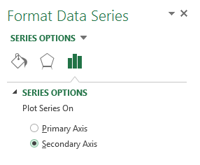
Excel tip: To add a second Y-axis, select one of your trend lines and right click. Select “Format Data Series.” Then select “Plot Series” on “Secondary Axis.” You can then edit the scale of the axis as you would for your primary Y-axis by clicking on your second Y-axis.
If we have too many metrics of varying scales, we will often create two graphs, making sure to align them and compare them together. It is helpful to look at them with one on the top of the
page and the other on the bottom of the page so that the dates on my X-axis align.
You can also compare similar metrics for different companies. Often, we will plot multiple lines within the same graph for each standalone company and/or the consolidated entity.
Step 3: Analyze your trends. Now that we have a graph of our key metrics, we observe the trends. Comparing the lines to each other is the most important aspect of our analysis. Yes, it is great to see the longer trend within a single metric, but what we are really looking at are the trends of each metric compared to the others.
Some of the questions to keep in mind are:
- What lines should have direct relationships versus inverse relationships?
- Is there a seasonal component?
- Is there a major event?
- Are lines parallel to each other or are they converging or diverging from each other?
- Are the trends in the lines smooth or erratic?
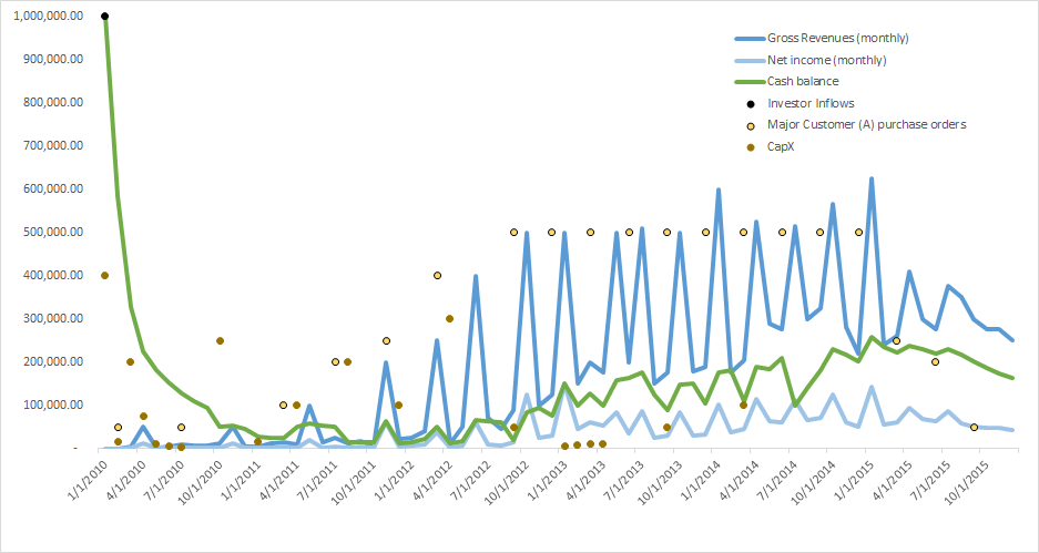
Be aware that when accumulating data over a long period of time, you may unintentionally smooth out the visualization of erratic monthly activity due to the longitudinal scale of your graph. To guard against this potential problem, my firm will also graph all of the accumulated items by monthly activity to check whether we missed a trend in the aggregation process.
You may also overlay years on top of each other rather than doing all periods on the X-axis.
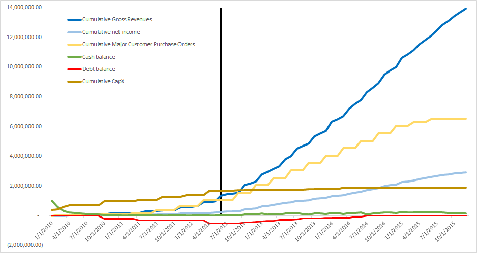
Frequently, it is helpful to use vertical lines (such as adding a timeline on top of our graph) to identify significant events or periods.
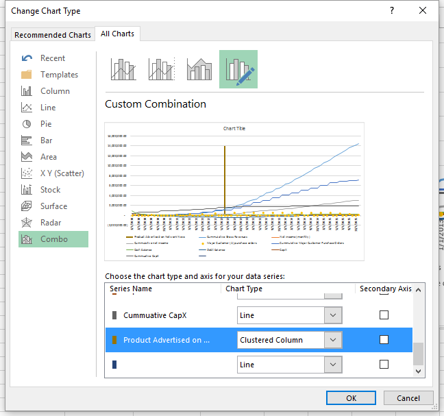
Excel tip: In the real world, you cannot plot a vertical line on a graph as the slope is undefined (dividing by zero). However, in Excel, there are several ways you can trick your graph to show a vertical line. One method is to create a new series in your data set. Set each value of the data set to be the maximum number you want the vertical line to reach and graph it with the rest of your data. It will show as a horizontal line. Then right click on your line and select “Change Series Chart Type.” It will bring up a dialogue box where you can change that series to be a column graph. Then you will have a bar going up for each date to what was your horizontal line. Then format the width of your bars to be very thin and they will look like vertical lines. You can also use this trick to add a scatter plot of some key transactions that maybe noteworthy to your analysis.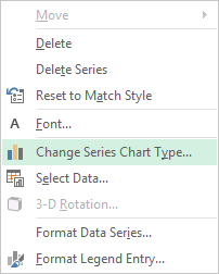
Here are some examples of the same fictional data set:
The possibilities are endless, and we find that it is a very iterative process. We are constantly adding and removing lines to analyze trends while trying to fully understand the financial statements we are examining. One final bonus from this type of analysis is that once you are ready to prepare any kind of final reports that need fancy graphs and images, you can just update or repurpose the graphics you already have.
[divide]
Danielle Supkis Cheek founded D. Supkis Cheek, PLLC in 2013 based in Houston, Texas. She is a Certified Public Account (CPA) in the State of Texas, a Certified Fraud Examiner (CFE) from the Association of Certified Fraud Examiner, and a Certified Valuation Analyst (CVA) from the National Association of Certified Valuators and Analysts. She is also an Adjunct Professor at the Rice University Jones School of Business. Ms. Supkis Cheek has been featured in many publications include the Journal of Accountancy, and she is a frequent lecturer on the accounting needs of private companies and practice management considerations for smaller CPA firms.
Ms. Supkis Cheek can be contacted at (713) 893-5625, or by e-mail to Danielle@SupkisCheek.com.


